


Sep 3, 2024
Mar 10, 2026
Taking Uncertainty Seriously: Part 3
.svg)

.svg)
Key Takeaways
- Simulation Explores Plausible Futures: Monte Carlo simulation generates thousands of possible scenarios by sampling from ranges of event frequency and loss magnitude, helping organizations understand how uncertainty can shape outcomes.
- Distributions, Not Predictions: The output of simulation is a distribution of potential results rather than a single forecast, showing where most outcomes cluster and how extreme losses might emerge.
- Making Tail Risk Visible: Tools like histograms and loss exceedance curves help executives understand the probability that losses could exceed certain thresholds, bringing clarity to discussions about risk exposure.
- Better Decision Conversations: By revealing how assumptions interact across uncertain variables, simulation helps boards and executives move beyond simple risk scores toward more informed discussions about acceptable losses and risk tolerance.
- Inputs Determine Credibility: The value of simulation depends on the quality of the assumptions used to define frequency and magnitude ranges, making transparency and defensible inputs critical.
Deep Dive
Separating how often from how bad gives the future shape, and for a lot of decisions, that shape is enough. The problem is that both frequency and magnitude are uncertain, and human intuition can strain when asked to hold too many combinations of uncertain factors at once.
The same event that is tolerable most of the time can occasionally be disastrous, not because anything fundamentally changed, but because several uncertain factors lined up in an unfortunate way. Your brain can only juggle so many combinations before it starts filling in gaps with guesses, and the gaps are where the interesting risk lives.
What Simulation Gives You (And Why It Is Not Prediction)
This is where simulation comes in, and where it tends to feel more complicated than it is.
Monte Carlo simulation has a branding problem. The name suggests casino mathematics, expensive software, and specialized expertise, none of which reflect what is happening under the hood. You define ranges for how often an event might occur and how bad it could be, then let a computer randomly sample from those ranges thousands of times to see what emerges.
That's it. That is the whole trick.
In most cases, frequency and magnitude are independent enough to sample them separately without distorting the result. A ransomware incident that happens twice a year doesn’t automatically cost more when it occurs; a breach that’s rare doesn’t necessarily cost less. But correlation exists in some domains. A breach triggered by supply chain compromise might be both rarer and catastrophic when it happens, not by coincidence but by mechanism. When frequency and magnitude are genuinely linked, you’d model that dependency directly rather than sample them independently. The simulation doesn’t hide this choice; it makes you name it.
What makes it useful is the framing: in most risk programs, everything is annualized, so when you run 10,000 trials, you are simulating 10,000 different versions of next year. Some of those years see frequent small incidents, others see rare catastrophic ones, and most fall somewhere in between.
The simulation explores all of those combinations by repeatedly sampling from your frequency and magnitude ranges, then shows you the distribution of what could happen, where most outcomes cluster, how long the tail stretches when things go wrong, and how often "bad but survivable" tips into "this changes everything."
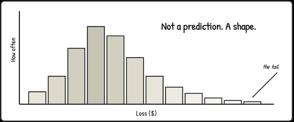
This is the part that gets misunderstood. People see a distribution and treat it like a precise prediction, as if the model is saying, "here is what will happen."
It is not.
A distribution is a map of plausible futures given your current assumptions, and it is only as good as those assumptions. Change the inputs, and the shape changes with them. The value is not that it tells you the future. The value is that it forces you to be explicit about what you believe, then shows you what those beliefs imply when uncertainty compounds across frequency and magnitude at the same time.
What you get back is a distribution, not a number.
The histogram shows you the shape of risk: where outcomes pile up and how fat the tails are. The loss exceedance curve answers the question executives care about most, "What are the chances we lose more than X?"
I call it the "What are the chances?" chart because that framing is what makes it land in a boardroom. It keeps uncertainty visible instead of collapsing it into a point estimate or a category.
Simulation aids human judgment. Instead of guessing how extreme the extremes might be or how often bad factors align, you are watching the consequences of your assumptions play out across thousands of plausible futures. Your intuition finally has something honest to react to.
Simulation belongs later in the journey. Introduced too early, it looks like unnecessary complexity. Introduced after uncertainty has been acknowledged and frequency and magnitude separated, it feels like a relief, a way to reason about the future without pretending you can pin it down.
Most organizations do not need to simulate everything. Simulation is for decisions where uncertainty is material and consequences are asymmetric. Using it everywhere would be just as misguided as never using it at all.
A simulation is only as honest as the ranges you feed it. If your frequency and magnitude estimates have no basis, the output will not either, it will just look better in a chart. What simulation does is make the tradeoffs visible, which makes responsibility harder to dodge.
I have watched executives see their first loss exceedance curve and go quiet for a moment in contemplation. The clarity comes from seeing what the risk looks like, not a color or a score, but the probability of exceeding different loss amounts.
The silence comes from realizing there is no clean threshold that makes the decision obvious. They are forced to consider acceptable losses, tolerable frequencies, and how much tail risk they are willing to bear.
Those conversations are harder than "Is it red or yellow?" They are also the ones that lead to better decisions.
In the next piece, we will discuss what changes when this thinking meets boards, budgets, governance, and accountability, and what stays the same. The goal was always to raise the standard, to make the forecasts we rely on less fragile and the decisions we make more honest.
Author Bio
Tony Martin-Vegue is an advisor, author, and independent researcher focused on quantitative cyber risk and decision-making under uncertainty. He has worked with Fortune 500 companies and global technology firms to design and operationalize quantitative risk programs, helping organizations move beyond qualitative reporting toward decision-grade risk analysis for executives and boards.
He is the author of the book From Heatmaps to Histograms: A Practical Guide to Cyber Risk Quantification (Apress, April 2026), which distills lessons from real-world program builds, thousands of risk analyses, and years of applied research into how organizations make risk decisions.
The GRC Report is your premier destination for the latest in governance, risk, and compliance news. As your reliable source for comprehensive coverage, we ensure you stay informed and ready to navigate the dynamic landscape of GRC. Beyond being a news source, the GRC Report represents a thriving community of professionals who, like you, are dedicated to GRC excellence. Explore our insightful articles and breaking news, and actively participate in the conversation to enhance your GRC journey.
Sponsored by
